Working on Visual Language....
 |
| Class Demo for in home studio class |
It's the first of February and among other things, I'm working on ideas for classes. Practice runs with different exercises help me develop a visual language that I pull from when it's time to demonstrate and talk with students.
The doing is part of the instruction and my hope is that this provides a framework for students going forward. I share my thoughts concerning methodology - how I approach the start of a painting, or my take on brushwork and handling the painting knife - always fun. I work to convey language that clarifies process or information in terms of the physical effort. Maybe it's the Art History student in me, but my intent is to give students process and terminology for whatever comes next, painting, exhibitions, talking with patrons...Happy Painting Processes. This includes drawing, value and perception of form as shape.
I do this with full understanding of the time and effort needed to make art. It took me a long while to make good use of ideas like working larger forms or patterns in a scene to the smaller details that refine a work. Although I was taught the benefits of the grey scale at school, over the years I've come to realize how to see the scale of values and make judgements concerning the pressure to apply to pencil or stick.
Through trial and error I have learned to use the tools of charcoal to benefit a drawing. I've hit walls while exploring mark making exercises with charcoal and oil, but know the benefit of running vertical and horizontal lines to examine relationships within forms at the start of a work. I've benefited from color charts like those below - a real gift. They take time and yet save me waste of time and paint in the end. I can explore color and value process with a small study, which provides opportunity to test and plan out color schemes before moving on to a large portrait, still life or landscape. Let's face it...paint is costly and I value the material each time I paint or purchase.
 |
| Portrait Tinting Chart in oil |
 |
| Exploration of how color informs another color - class material |
 |
| Color Mixing Chart for Acrylics |
The image below shows a typical studio day. I'm preparing two set ups for demonstration in my Thursday night paint class. The study on my easel shows acrylic on primed paper with focus on the smaller bunch of grapes to the left. I use cardboard boxes for set ups within classes to enhance the effect of light and shadow against some diffused lighting. The boxes work well and are easy to transport, and carry paint materials. I've shared this idea with middle and high school students, and have had productive class times using these as a learning tool in terms of how to create a space for still life. The students brought in boxes pulled from local markets and I supplied paint and brushes to transform the interior of the box. We used basics, black, white to achieve grey, with red to warm up the color as needed. Students go outdoors to paint the boxes, returning inside to assemble pieces for still life while the boxes are drying in the sun. The result has been a great painting from life process.
 |
| Detail of Grapes with Burnt Sienna for block in |
 |
| Studio set up - looking at demo for class with students |
Below are demo sketches in charcoal that show application of the medium with pencil, vine and compressed charcoal sticks. Thanks for stopping by...I invite you to visit me at
donnashiver.com
Peace and Health all - :)
 |
Pear Studies - eraser, stump and charcoal dust, line with vine charcoal and tone with vine.
|
 |
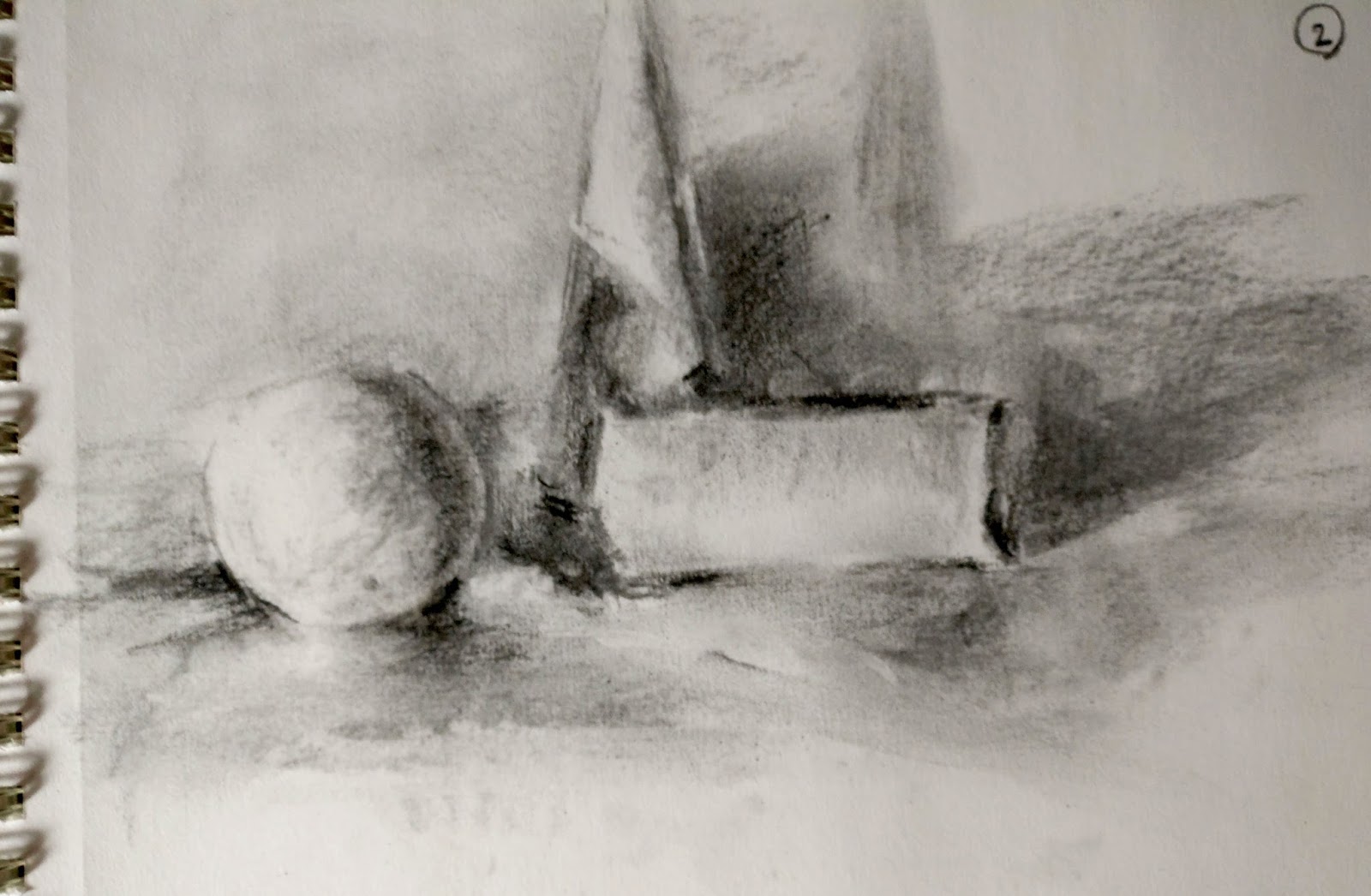
| Basic Shapes set up for drawing from life in charcoal class |
 |
| Grey Scale, value comparisons |
 |
| Approach to Basic Shapes in pencil, demo |
 |
Demo mid-way through
- vine charcoal
|
 |
| Blocking in basic shapes, noting patterns of value |
 |
| Mark Making Exercise/Demo for class on paper |
 |
| Sketch for At Play - charcoal on paper |


No comments:
Post a Comment